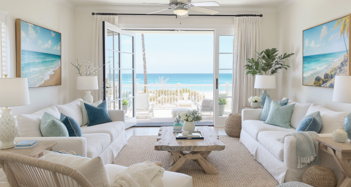
Blue and white have become shorthand for seaside decorating. The pairing is understandable: blue recalls water and sky, while white suggests sunlit walls, sails, and pale sand. Yet when every room relies on the same two colours, coastal style can become predictable. A more considered interior begins with what a particular shoreline actually looks and feels like. Some coasts are slate grey and rust-coloured rock; others are green with dune plants or almost black beneath storm clouds. Taking those details seriously produces rooms that feel connected to a real landscape rather than to a generic idea of the beach.
Start by separating a coastal mood from a coastal colour scheme. A room can feel open and relaxed through natural light, breathable textiles, uncluttered surfaces, and a strong view across a wall—even if there is no blue in it at all. A monochrome photograph of breaking surf can supply the coastal reference while the rest of the palette stays warm white, mushroom, tobacco, or charcoal. A print of dunes may introduce straw and muted olive. This approach lets the art carry the setting without forcing every cushion, vase, and accessory to repeat it.
Architectural Digest’s guide to coastal interiors describes a style that uses soft neutrals, clean lines, and natural textures such as wood, linen, jute, and rattan. Its emphasis on avoiding kitschy motifs is especially relevant here: atmosphere often comes from the balance of materials and light, not from a catalogue of beach symbols. The article [Coastal Interior Design: Everything You Need to Know](https://www.architecturaldigest.com/story/coastal-interior-design-101) is a useful reference for distinguishing a nuanced coastal room from a literal nautical theme.
A practical way to build a palette is to take three tones from the landscape rather than sampling the most obvious colour. For a rugged coast, those might be charcoal rock, warm grey sand, and the pale cream of sea foam. For a dune setting, try flax, soft green, and chalk white. Use one tone as the foundation, another in a substantial textile or piece of furniture, and the third in smaller details. The artwork can contain all three without requiring exact matches elsewhere. Slight differences in tone keep the room from looking as if it was purchased as a coordinated set.
Black-and-white coastal images are particularly useful when the furniture already has a strong colour identity. A rust sofa, olive armchair, or deep burgundy rug can coexist with a monochrome beach photograph because the art does not introduce another competing hue. Instead, it adds shape, texture, and contrast. The black-and-white coastal wall art can be considered when a room needs a coastal subject but not another colour to manage. The same principle works with black frames, pale timber, and brushed metal: choose a finish that supports the existing materials rather than trying to make every object match the picture.
There is also a difference between a palette that looks good in a photograph and one that works in everyday life. A very pale room may feel bright at midday but flat on a grey afternoon. A dark, high-contrast print can add definition when natural light is limited; a softer image may be more restful in a bedroom that receives strong morning sun. Observe the room at different times before deciding. Colour changes with light, and the artwork should feel connected to the room across ordinary hours, not just under ideal conditions.
The strongest coastal interiors leave space for things that are not coastal. A vintage chair, a contemporary lamp, a family photograph, or a colourful ceramic piece can make the room feel lived in rather than themed. Art is a bridge between these elements, not an instruction to decorate everything around it. If the picture contains a broad pale sky, leave some wall space around it. If it is dark and textured, balance it with a softer textile or a lighter wall. Contrast creates interest; repetition should be used selectively.
Moving beyond blue and white does not mean rejecting those colours. It means choosing them deliberately rather than treating them as requirements. When a room takes its cues from the actual character of a coast—its stone, weather, vegetation, light, and changing water—the result is more specific and more personal. A well-chosen coastal print can anchor that relationship, while the rest of the room remains free to express the people who live there.
A final test is to look at the palette in context rather than in isolation. Put a sample of the wall colour beside the sofa fabric, timber finish, and a print viewed on screen at the intended size. Then imagine the room without the artwork: what is missing? If the answer is simply “more blue,” the choice may be too colour-led. If the room lacks contrast, depth, or a sense of openness, look for an image that answers that need. This approach keeps the palette flexible and prevents a coastal room from becoming locked to one trend. It also allows future changes—a new rug, a different cushion, or a second-hand chair—to sit comfortably beside the art.
References
Architectural Digest — Coastal Interior Design: Everything You Need to Know